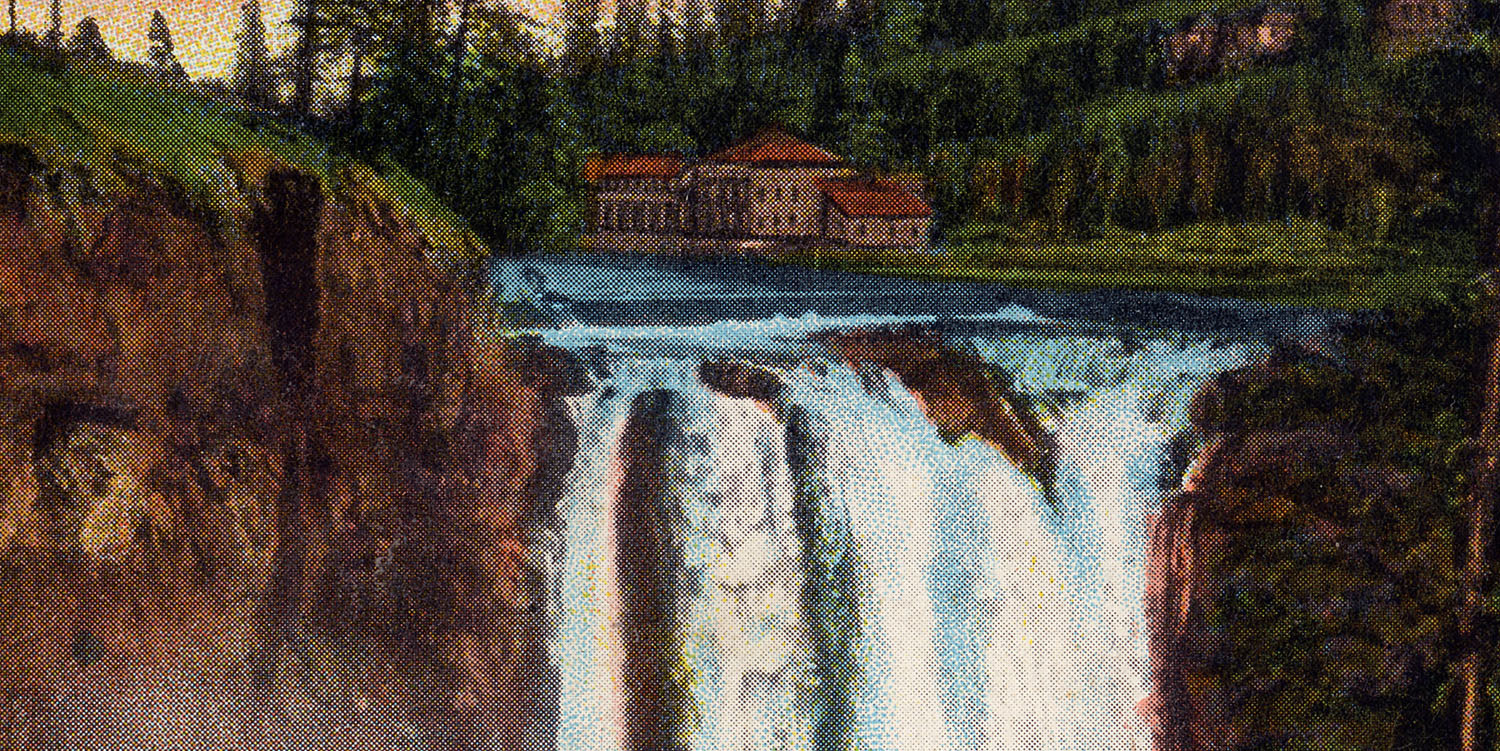
One reason I enjoy collecting Snoqualmie Falls postcards is that I get to play detective. Many cards in my collection are more than 100 years old. Each one becomes a mystery to solve. Some postcards are easily identifiable while others take some deductive reasoning to determine their origin. Take another postcard published by C.P. Johnston Co. of Snoqualmie Falls. It appears to have been based on a photograph taken by legendary Pacific Northwest photographer Asahel Curtis.
SNOQUALMIE FALLS POSTCARD BY C.P. JOHNSTON CO. – 4001 | FRONT
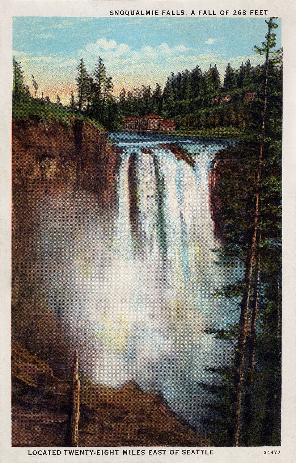
The front of this Snoqualmie Falls postcard shows the majestic and sacred waterfall “located twenty-eight miles east of Seattle” The top of the card identifies the location – Snoqualmie Falls, A Fall of 268 Feet. There is a catalog number along the bottom – 34477 – to which I’m unclear if that relates to the photo or the card.
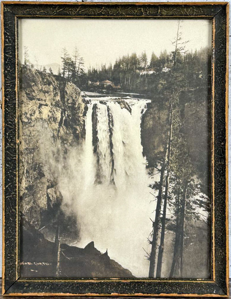
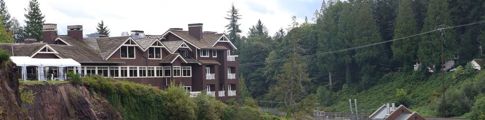
The image seems to be inspired by Asahel Curtis’ photo of the falls. The image was captured prior to 1916 as you’ll notice the former Snoqualmie Falls Lodge (known today as Salish Lodge & Spa). HistoryLink.org shared an insightful article about Curtis’ work:
“The Seattle-based photographer Asahel Curtis (1874-1941) made 60,000 photographic images over a 44-year career. They provide a remarkable visual record of the Pacific Northwest. He was the brother of the renowned photographer Edward Curtis; the brothers had a falling out when they were in their 20s, and never reconciled.”
You may recognize Asahel’s name as I discussed his work found in the Twin Peaks Sheriff’s Department during the Twin Peaks pilot.
The Snoqualmie tribe holds Snoqualmie Falls as a sacred space. It’s part of the creation story which says Moon the Transformer created the falls and the first Snoqualmie Man and Woman were made at this sacred spot. I invite you to stop by the Snoqualmie Falls Gift Shop where you can learn more about the importance of the land to the tribe. Learn more about what you can do to protect, respect and restore it on the Snoqualmie Tribe Ancestral Land Movement website.
SNOQUALMIE FALLS POSTCARD BY C.P. JOHNSTON CO. – 4001 | BACK
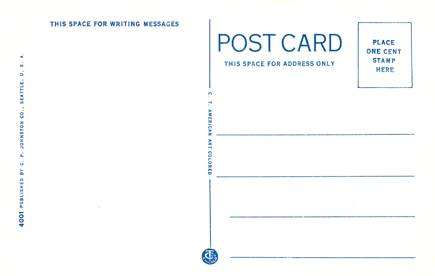
The back of the card contains the manufacturing details including the catalog number of 4001.
The card was colored by C. T. American Art based in Chicago, Illinois. Founded in Chicago in 1898, the Curt Teich Company would become the most dominant printer of postcards in the United States. ImmigrantEntrepreneurship.org offered a lengthy explanation of the how Teich created these cards which was basically done by adding shading and depth to pictures and adding colors using a lithographic process.
Litho stones were replaced by metal plates, grained by rounded small stones, gathered at Chicago’s Lake Michigan front. The artists traced the outlines of the colors on the plates, then designed the four separate color plates, yellow, red, blue, and pink. The zinc plates were etched, inked and hand impressions pulled on china and Columbia transfer paper. Post cards [sic] designs were assembled, 32 subjects to a sheet, halftones made from the black photographs and printed on card board in black ink on Miehle presses. Colored impressions were assembled, stuck up and pulled over on larger stones for color lithographing. The new process was named ‘C. T. American Art’ process. It was such a difficult process that in the writer’s opinion nobody would want to imitate it. He did not protect this process by patent, so competitors copied it.
This could explain why there are so many cards that look similar to Curt Teich’s style. Nevertheless, I’m happy to add this one to my endless postcard collection.
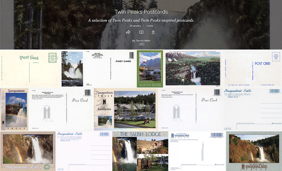
Download high-resolution image of this card and many other on my Flickr account: https://www.flickr.com/photos/aloha75/albums/72177720331531617/
Author

Discover more from TWIN PEAKS BLOG
Subscribe to get the latest posts sent to your email.